Easy data visualization techniques that drive buy in

The purpose of data visualization is to make people aware of a situation, and motivate them to take action.
Ask yourself this, which statement would be more impactful to the senior executives you serve? If you’re having a conversation with someone without visuals, which one paints a picture in their mind?
56% of our account executives have a skill gap in qualifying sales opportunities
or
More than 1 out of every 2 people have a skill gap in qualifying sales opportunities
How about these two graphics? Which one would be more impactful?
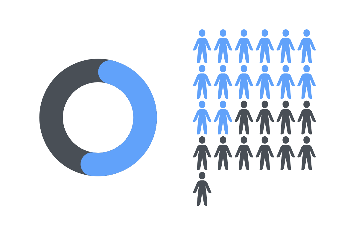
The one on the right, known as an infographic, is designed to improve understanding by using our innate ability to see patterns and trends. By connecting the problem of a skill gap with an image of people, the data point takes on a greater sense of urgency.
The purpose of data visualization is to help make people aware of a situation and motivate them to take action. It is a way of influencing people to support your recommendations. We find it is much more compelling to tell the story and let your audience draw conclusions than if you make recommendations. That makes them think it’s their idea… because they came to that conclusion on their own. That’s how you get buy-in.
Storytelling with data is compelling because you engage your whole brain – your right brain processes the story and the left brain processes the data logically.
How to craft your story
Here is a skill practice we provide to our customers to teach them how to tell a data story. Watch the video, then review the steps.
Watch the Storytelling with Data video (7 minutes). (Paul Smith)
Did you notice that the data visualization, the equation, was not what you would have expected?
Use the template to document a beginning, middle, and end (result).
Incorporate an element of surprise.
The template includes boxes to capture the Beginning (Context), Middle (Challenge/Conflict), Element of Surprise, End (Result), and Data points & visuals to include.
Practice delivering the story. Be sure to get comfortable using the emotional impact of a pause to let the audience absorb the story and draw their own conclusions.
Record yourself with a teleconference system, watch it back, and continue until you can deliver the story naturally.
Tell it to a peer, get their feedback, and incorporate as appropriate.
“To be effective with your story, you need to know the busines objectives of your audience. You’re trying to get to the “So what?””
An example story
How do you put this technique into practice? Let me give you an example that we run into all the time. Everyone knows there’s a huge skill gap problem, but not every organization is motivated to close them. So you need to get your leaders to want to support your efforts.
The critical data set is the results of a competency assessment. You know the strengths and the skill gaps of your audience. And what you’re looking to do is use that information to justify the development of learning assets to close those skill gaps and focus on getting the business to really commit to development.
To be effective with your story, you need to know the business objectives of your audience. You’re trying to get to the “So what?” So what if we have these gaps? Look at the top skill gaps and see which of them, if not closed, will impact the ability to accomplish the business objectives. Stay focused on the top 2-3 most relevant gaps.
Gap: Top sales gap is the inability to qualify sales opportunities
So what?: If we’re wasting time chasing sales opportunities that will never close, we won’t achieve our target sales numbers.
If you have additional supporting data, include that as part of your context. For example, if you have sales funnel analytics over time showing a huge drop off in opportunities after qualification into the next stage, that will make for a more compelling story. Trends are a very useful data point.

You can see that this data visualization doesn’t require sophisticated infographic capabilities. You could whiteboard it.
If you know exactly when the change occurred and can tie it back to some specific program that ended, people who left the organization, or restructuring, that can be your element of surprise.
Other ways to introduce the element of surprise is to get your audience involved through prepared discovery questions.
Are these the results you expect?
How do these results compare with previous results? How are they trending?
Are you content with these results?
What costs will you incur or revenue will you lose because of these numbers?
Know your own recommendations, but ask for theirs. Be prepared to shape their recommendations based on your experience.
For example, let’s say a leader says, “Well, it’s obvious we need a training class.” You need to be ready to inject other ideas. We know that most one-time training events aren’t enough to change behavior. You need tools to help people apply that learning on the job (job aids, skill practices), supported by managers and leaders who are committed to behavior change. Maybe you need an inside salesperson to be inserted into the sales process before your highest paid salespeople get involved. There are lots of alternatives. Be sure you’ve thought them through and can use your facilitation skills to help leaders navigate the discussion, leading them to your desired conclusion and recommendation.
“It is much more compelling to tell the story, and let your audience draw conclusions than if you make recommendations.”
Number Play as a story
Another data visualization technique is called a number play. Studies show that people remember numbers more easily than other things. Create a number play with 4 interesting numbers. Start and end your presentation with them. For example:

Don’t tell them what the numbers mean yet, you’ll do that reveal (the surprise) one slide at a time. Be sure you have a slide to support each number, and use an appropriate data visualization technique to show it.
3 – the number of tasks where more than 75% of people had a strength
5 – the number of tasks where more than 75% of people had a skill gap
92 – the % of people with at least 5 skill gaps
34 – the % of people who completed an activity on their Development Plan in the last month
In other words, 92% of people have many skill gaps, but only 34% of people are doing something about it.
For each number, ask, “So what? What does that mean to you?”
How can you leverage the strengths to accomplish your business objectives?
What will the gaps do to our business if we don’t close them?
If we have the gaps, but people aren’t committed to developing themselves or given the time to do so, how will that impact our competitive advantage?
Document the discussion for each number. Let them come up with recommendations.
On the final slide, show the number play again and ask them, “What’s 3? Why is this important to us? And what are we going to do as a result?” They will walk away from your 6 slide presentation remembering the key numbers you want them to remember and will have committed to supporting their own recommendations.
Which data visualization should I use?
The best data visualization is the one that requires no explanation, and drives the user to the best conclusions.
Remember that you want to surprise the audience, but you never want to mislead them. Once you know what story you want to tell, it’s easy to pick the right visualization.
If you want to analyze trends, you might use a line or a column chart.
For example, if I want to show that the number of skill gaps each person has is growing, I could put it on a column chart to show the change in count over time.
If you want to understand the distribution of data, you might use a scatter plot.
For example, if I want to show the distribution of business results for people who have engaged in development activities, I could put results on one axis and number of activities on the other.
If you want to show how individual parts make up the whole of something, you might use a pie chart or stacked bar chart. But as we showed earlier, an infographic can be very powerful.
For example, you might show the percentage of people who are and are not actively participating in activities. And you might have different graphs for each region to show regional variations, particularly if some regions have better business results.
If you want to understand the relationship between values, you might use a scatter plot or bubble chart.
For example, if I want to show business results compared to development activities, I could put results on one axis and frequency of activity on the other, while the bubble size could represent the number of activities.
More data visualization resources
Use this article from Hubspot for additional techniques on design best practices for each type of chart.
Or Hubspot’s detailed ebook: Presenting Data People Won’t Ignore.